Lunch and Learn: Creating Rubrics and Calibrating Multiple Graders

Logo for Lunch and Learn program showing the words Lunch and Learn in orange with a fork above and a pen below the lettering. Faculty Conversations on Teaching at the bottom.On Friday, December 15, the Center for Educational Resources (CER) hosted the second Lunch and Learn—Faculty Conversations on Teaching—for the 2017-2018 academic year.  Laura Foster, Academic Advisor, Public Health Studies, and Reid Mumford, Instructional Resource Advisor, Physics & Astronomy, presented on Creating Rubrics and Calibrating Multiple Graders.

Laura Foster led by giving us a demonstration of her use of Blackboard for creating rubrics. She noted that she might be “preaching to the choir” but hoped that those present might take back these best practices to their colleagues. Noting that many faculty have negative opinions of Blackboard, she put in a plug for its organizational benefits and facilitation of communication with students.

Foster started using Blackboard tools for a Public Health Studies class where she was grading student reflections. The subject matter—public health studies in the media—was outside of her field of physical chemistry. Blackboard facilitates creating a rubric that students can see when doing an assignment and the instructor then uses to grade that work. She showed the rubric detail that students see in Blackboard, and how the rubric can be used in grading. [See the CER Tutorial on Blackboard Rubrics and Rubrics-Helpful Hints] The rubric gives the students direction and assures that the instructor (or other graders) will apply the same standards across all student work.

It empowers students when they know exactly what criteria will be used in evaluating their work and how many points will be assigned to each component. Foster has found that using rubrics is an effective way to communicate assignment requirements to students, and that it helps her to clarify for herself what at the most important points. She noted that a rubric is very useful when there are multiple graders, such as Teaching Assistants (TAs), as it helps to calibrate the grading.

In response to questions from the audience, Foster stated that rubrics can be developed to cover both qualitative and quantitative elements. Developing good rubrics is an iterative process; it took her some time to sharpen her skills. There is flexibility in differentiating points allotted, but the instructor must be thoughtful, plan for a desired outcome, and communicate clearly. The rubric tool can be used to grade PDF files as well as Word documents. Foster noted that it is important to take opportunities to teach students to learn to write, learn to use technology, learn to read instructions, and learn to look at feedback given on assignments. Being transparent and explaining why you are using a particular technology will go a long way.

Reid Mumford gave his presentation on how he calibrates multiple graders (see slides). Mumford oversees the General Physics lab courses. This is a two semester, required sequence, so not all students are excited to be there. The sequences are on Mechanics and Electricity and Magnetism; both labs are taught every semester with multiple sections for each course. Approximately 600 to 700 students are taking these lab sequences each semester; students are divided into sections of about 24 students. The labs are open-ended and flexible, so students aren’t filling in blanks and checking boxes, which would be easier to grade. Lab sections are taught and graded by graduate student TAs, with about 30 TAs teaching each semester. Teaching and grading styles vary among these TAs as would be expected. Clearly, calibrating their grading is a challenge.

Grades are based on the best 9 of 10 lab activities, which consist of a pre-lab quiz and a lab note. All activities are graded using the same rubric. The grading scale used can be seen in the slides. One of the criteria for grading is “style,” which allows some flexibility and qualitative assessment. Students have access to the rubric, which is also shown in the slides.

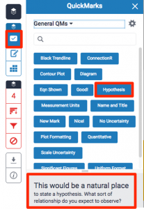
About three years ago, Mumford adopted Turnitin (TII), the plagiarism detection tool, for Screen shot of Quick Mark grading tool.its efficient grading tools. It works well for his use because it is integrated with Blackboard. TII does its job in detecting cheating (and Mumford noted that lots of students are cheating), but it is the grading tools that are really important for the TAs. TAs are encouraged to be demanding in their grading and leave a lot of feedback, so grading takes them two to four hours each week. TII’s Feedback Studio (formerly known as GradeMark) allows TAs to accomplish their mission. [See CER tutorial on Feedback Studio and The Innovative Instructor post on GradeMark.] It was the QuickMark feature that sold Mumford on Feedback Studio and TII grading. Using the rubric for each activity, QuickMark can be pre-populated with commonly-used comments, which can then be dragged and dropped onto the student’s submitted work.
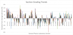
Graph showing General Physics Laboratory Section Grading Trends.These tools helped make the grading load more efficient, but calibrating the multiple graders was another challenge. Mumford found that the TAs need lots of feedback on their grading. Each week he downloads all the grades from Blackboard grade centers. He creates a plot that shows the average score for the weekly lab assignment. Outliers to the average scores are identified and these TAs are counseled so that their grading can be brought into line. Mumford also looks at section grading trends and can see which sections are being graded more leniently or harshly than average. He works with those TAs to standardize their grading.

In calculating final grades for the course, Mumford keeps three points in mind: final letter grades must be calculated, there should be no “easy” or “hard” sections of lab, and distribution should not vary (significantly) between sections. He makes use of per-section mapping and uses average and standard deviation to map results to a final letter grade model. Mumford noted that students are made aware, repeatedly, of the model being used. He is very transparent—everything is explained in the syllabus and reiterated weekly in lab sessions.

In conclusion, Mumford offered these take-aways:

  • Calibrating Multiple Graders is not easy
  • Tools are needed to handle multiple sections efficiently
  • Rubrics help but do not solve the calibration problem
  • Regular feedback to graders is essential
  • Limit of the system: student standing is ambiguous

In the future Mumford plans to give students a better understanding of course standing, to calculate a per-section curve each week, and to overcome some technical issues and the greater time investment that will be required with weekly calibrating and rescaling.

Macie Hall, Senior Instructional Designer
Center for Educational Resources

Image Sources: Lunch and Learn Logo, slides from Mumford presentation

Thinking about Accessibility Part 2

Four universal signs for disabilities: wheelchair access, hearing access, captioning, visual accession. Signs are white on blue background.Last week ‘s post summarized the first part of an important article by Anne-Marie Womack, Teaching Is Accommodation: Universally Designing Composition Classrooms and Syllabi, College Composition and Communication, February 2017. Womack, assistant director of writing at Tulane University, encourages instructors to rethink accommodation as normative rather than an exception to a rule.

The second part of the essay focuses on creating an accessible syllabus both in theory and in practice by “moving from syllabus as contract to syllabus as accommodation.” This can be accomplished in a number of ways, starting by not limiting the notion of accommodation to a paragraph stating the institutional disability policy. Syllabi are often heavy on text and present inflexible policies written in a punitive and/or defensive tone. Womack suggests instead that instructors strive to create accessible documents that engage students with “cooperative language” and flexibility in assignments. She does acknowledge that it is important to consider the particular student audience in designing a syllabus—one solution doesn’t fit all. Instead, she suggests three strategies.

The first strategy is Creating Accessible Document Design. Reducing the amount of text in your syllabus is the primary consideration. Womack starts with the boilerplate policies that may be required by the institution, school, or department. Such information may be reduced to basics, linked to, or included at the end in an appendix. Other information can be provided during the semester as it is needed, e.g., assignment specifics, writing prompts.

How the text is formatted can make a big difference—Womack suggests trading some text for accessible images. This will necessitate the creation of alternative text (alt text) to describe the image for those who use screen readers. She suggests that alt text be “focused on data, not extraneous visual details.” Since images can introduce color that may not be visible to all readers, there are guidelines for best practices. (I’ve included some resources for creating accessible images and documents at the end of this post.) Womack shows examples of how she converted her syllabus from text heavy to accessible by using images, blocks of text, bulleted lists, and icons, and increasing the amount of white space. Using a larger font size and a san serif font will also improve readability. Your goal is to “make the syllabus user-friendly” because you want your students to use it. Other tips include creating a table of contents for improved navigation, making internal hyperlinks to connect items within the syllabus, using headings to establish hierarchy, bolding text to emphasize key ideas.

The second strategy Womack advocates is Engaging Students with Cooperative Language. You want to convey “approachability and empathy” rather than making students feel uncomfortable requesting accommodations. Don’t focus on negative consequences and punitive rules. Instead look at inclusive practices in your syllabus as a means to engage student cooperation.

Womack suggests beginning with an “inclusive learning statement” and offers an example:

Your success in this class is important to me. We will all need accommodations because we all learn differently. If there are aspects of this course that prevent you from learning or that form barriers to your inclusion, please let me know as soon as possible. Together we’ll develop strategies that can enable you to succeed in the course.

I encourage you to visit the Office of Disability Services to determine how you could improve your learning as well. If you need official accommodations, you have a right to have these met. There is also a range of resources on campus, including the Writing Center, Tutoring Center, and Academic Advising Center. (Figure 5, p.513).

Further, she gives examples of positive versus punitive language, commands versus invitations, and cooperative versus paternalistic language.

The third strategy is labeled Empowering Students through Flexible Course Plans. Womack saw that “traditional accommodations, such as longer time and adaptable assessment, provide a starting point to improve course practices.” Citing a number of research studies, she states that students are more motivated to learn when they feel they have autonomy. Womack suggests ways in which instructors can give students control. She discusses allowing students flexibility in deadlines. Her approach combines student-set and instructor-set deadlines, which allows an extended time-frame but prevents students from falling behind. Low-stakes writing assignments and incremental assignments may also provide flexibility. Minimal grading for some of this work is recommended. Womack also examines building flexibility into grading distributions. She focuses on those which work well for her writing courses, including contract grading where a system of assessment is negotiated. While this aspect of flexibility may be more difficult to incorporate into large lecture courses, the point is that assessments and grading should be carefully considered. Allowing students to drop the lowest grade in a series of quizzes or homeworks is an easy means of allowing students flexibility and control in a larger class.

In concluding Womack reminds us that accommodation does not give disabled students an unfair advantage; “it is more likely all students have been given an unfair disadvantage through inaccessible pedagogy.” We should look at the “best versions of accommodation” as a way of teaching inclusively to a diverse audience and adapting in response to individual needs.

While Womack offers some good examples in her essay, there are some great resources with “how-to” guides available. Womack created a website at Tulane University on making an accessible syllabus that frequently cited, but alas, no longer “accessible.” However, you can view an archived image of the site here.

If you are someone who likes video tutorials, the University of Minnesota Accessible U has a series of video tutorials on creating an accessible syllabus and making accessible documents and accessible PDFs.

You will also want to check out the University of Colorado Boulder Universally Designed Syllabus Materials website “to employ best practices when creating a course syllabus.” Some of the material is UC system-specific, but much of the information is widely applicable.

Macie Hall, Senior Instructional Designer
Center for Educational Resources

Image Source: Pixabay.com

Thinking about Accessibility Part 1

Four universal signs for disabilities: wheelchair access, hearing access, captioning, visual accession. Signs are white on blue background.Often I read an article or blog post and suddenly find that I am falling down a rabbit hole. Hours, or even days, later I emerge, having uncovered a wealth of information and resources that have to be edited down in order to present a reasonably digestible overview of a topic for you readers. Such was the case with David Gooblar’s post Now is the Time to Think About Accessibility on his Chronicle Vitae Pedagogy Unbound blog (August 8, 2017). From the links in his article, I went on to discover other great material on accessibility to share—enough good stuff for two posts. This first post will cover thinking about accessibility in your classroom in general; next will be a follow-up post focused on creating an accessible syllabus and other documents for your class.

Gooblar starts off by noting that for many instructors, accessibility is given a brief mention at the end of the syllabus and then forgotten. Accessibility is seen as “an exception to the norm” and given little thought. He then notes an article by Anne-Marie Womack, assistant director of writing at Tulane University, which takes issue with that way of “conceptualizing accessibility.”

Teaching Is Accommodation: Universally Designing Composition Classrooms and Syllabi (College Composition and Communication, February 2017) by Anne-Marie Womack should be required reading for all higher ed instructors. [Note: if the link does not work, try copying and pasting this URL directly into your browser: http://www.ncte.org/library/NCTEFiles/Resources/Journals/CCC/0683-feb2017/CCCC0683Teaching.pdf.] It is an important document that asks us to rethink disability and academic accommodations. She starts by discussing “contemporary theories of disability to retheorize accommodation as the process of teaching itself.” Womack provides a history of disability law and American institutions of higher education, noting that students today must “pass substantial hurdles to qualify for accommodations” often at the risk of being stigmatized. Faculty, who may receive little institutional support, come to feel that they are the ones burdened by the process. Any resulting pedagogical changes are seen as affecting only the students with disabilities.

Womack argues that resistance to accommodation by university administration and faculty assumes that accommodations are an exception to a rule, to a best practice, or normal way of teaching. Womack states, “Ultimately, though, there is no normal, primary way of learning, only normalized methods made primary through frequent use. Material always changes as it moves from expert to novice. Every act of teaching is an accommodation because it creates certain conditions for students to learn and display learning.” Even though effective student learning means that the material is accessible, instructors have come to feel that “making material accessible to disabled students threatens academic rigor.”

Seen from another vantage point, inclusive teaching means eliminating barriers to learning, not eliminating intellectual challenges. Womack says, “Accommodation is the most basic act and art of teaching. It is not the exception we sometimes make in spite of learning, but rather the adaptations we continually make to promote learning.” She advocates accommodation of disabled students within a universal design framework.

Universal Design is the design and composition of an environment so that it can be accessed, understood and used to the greatest extent possible by all people regardless of their age, size, ability or disability.” Universal design is good for everyone. In your classroom, Womack suggests, for example, considering guidelines for dyslexic and blind readers, working under the assumption that by creating documents that more students can read, more students will read. She warns, however, that universal design must be used as a process, not to negate the need for accommodations, but to start to negotiate the means to accessibility for all.

In my next post I will look at the second part of Womack’s article, which provides suggestions for creating accessible documents, engaging students by using “cooperative language” and building flexibility into your course to empower students. “If instructors see the syllabus through the lens of disability, then the question becomes not how policies protect a normative standard but how far they extend inclusion.”

Macie Hall, Senior Instructional Designer
Center for Educational Resources

Image Source: Pixabay.com

The Open Faculty Patchbook: An OER on Pedagogy

We are seeing an increased interest in Open Educational Resources (OER) in our library and among faculty. [See Consider the OER an Innovative Instructor blog post by Marian Feldman, November 7, 2016.] What is an OER? Wikipedia defines open educational resources as being “freely accessible, openly licensed text, media, and other digital assets that are useful for teaching, learning, and assessing as well as for research purposes.”

With the skyrocketing costs of textbooks used in higher education, colleges have responded to student demand by instituting programs to support the production of OER texts, especially for discipline-standard introductory courses. There is a listing of OER initiatives, resources, and projects on the SPARC (the Scholarly Publishing and Academic Resources Coalition) website. The Open Education Consortium also lists OER initiatives, including a list of open textbooks.

Image resembles a patchwork quilt with 26 hexagonal patches, each with a stylized image of a person representing the authors of the articles making up the book.By happenstance, I came across an OER written by faculty for faculty on pedagogy. The Open Faculty Patchbook was created by faculty at Fleming College in Peterborough, Ontario.  The Learning Design and Support Team at Fleming was tasked in 2016 with revising the faculty development model. Inspired by a presentation given by Robin DeRosa at the 2016 Open Education Conference in Richmond, Virginia, the team decided to create a how-to teach manual. They came up with the metaphor of a quilt, with each contributor creating a “patch” to add to the “community quilt of pedagogy.” Currently, there are 21 pieces describing how instructors do their work. Topics include cohort-based-learning, teaching within the Universal Design for Learning (UDL) framework, activating students’ background knowledge, formative assessments, facilitating deep learning, laboratory assessments, co-teaching, group work, and more.

The Patchbook was initially designed to cover the University of Michigan’s School of Education High Leverage Practices, which are described as “…the basic fundamentals of teaching. These practices are used constantly and are critical to helping students learn important content. The high-leverage practices are also central to supporting students’ social and emotional development. These high-leverage practices are used across subject areas, grade levels, and contexts. They are “high-leverage” not only because they matter to student learning but because they are basic for advancing skill in teaching.”

The patches in the Open Faculty Patchbook are relatively short, making this an easy to digest guidebook. It is also open to contributors for additional patches. At the end of the current book is the statement: “Future versions planned include ones focused on professional learning, digital pedagogy (online learning) and course design. If you would like to contribute, email ldsteam@flemingcollege.ca with the subject heading ‘I’m awesome. I want to add a Patch’. Your patch, when complete, would immediately appear on our WordPress site facultypatchbook.wordpress.com and be added to a Pressbook publication.”

Macie Hall, Senior Instructional Designer
Center for Educational Resources

Image Source: Open Faculty Patchbook

Teaching Transparently

Back in September 2015, The Innovative Instructor posted Do Your Students Understand the Assignment?, an article that examined the concept of transparent Semi-spherical transparent soap bubble on a grey wood surface.teaching. Transparent teaching helps students understand the why and how of their learning. Research from the University of Nevada, Las Vegas (UNLV) Transparency in Learning and Teaching Project (TILT) has shown that when students understand the task, its purpose, and the criteria for evaluating their work, they are more motivated and feel the work is more relevant. The TILT website has some excellent suggestions and resources for instructors, including examples of assignments from various disciplines presented in two versions, less transparent and more transparent, for comparison.

A recent post on Teaching Tidbits,  a blog sponsored by the Mathematical Association of America to keep higher ed math faculty up on advances in educational research and pedagogical practices by providing “…quality, evidence-based ideas with high impact and low time commitment that can be used by a wide audience,” examined teaching with transparency. [October 24, 2017, How Transparency Improves Learning by Darryl Yong] Although the focus is on teaching college mathematics, the key points are applicable to a range of subjects.

Yong starts by citing the work done at UNLV, noting in particular the finding that underrepresented students experienced the greatest improvement in learning outcomes when transparent teaching methods were used. Yong speculates that transparent teaching helps to level the playing field for these students.

A key to teaching more transparently is to see things from your students’ vantage points. What would they find “bewildering, frustrating or alienating?” Being transparent does not mean that you don’t expect the work to be challenging rather that you will “engage your students in a productive struggle.”

Providing instructions in more than one format is helpful. For example, you should include information on assignments in writing on your syllabus, verbally in class, and again in written form in handouts to be sure that students aren’t missing important details.

Yong says, “The amount of transparency that you provide to students depends on their maturity and the level of the course. There are times when you don’t want to be explicit about everything. For example, you don’t want to constrain their creativity by priming them with examples, you want them to struggle with figuring out what the first step should be, or you want them to be more independent in their learning.”

He concludes the post with some suggestions on transparency for mathematics courses, but even these can be translated to more general use. The concepts are:

  • Be sure that students understand discipline-specific terminology.
  • Be clear about the tools, applications, and resources are students allowed to use for assignments and exams.
  • Explain why you have chosen a particular assignment, project, or type of exam. Connect these choices to their learning outcomes. Share strategies that successful students have used in the past for assignments and evaluations. Share rubrics when used for grading. Share examples of successful projects.
  • Tell students why you have chosen the pedagogical strategies you use to teach.
  • Start each class by highlighting a relevant current area of research and the people doing it. If your field has not been inclusive in the past, acknowledge that and “showcase women and people of color in these highlights to engage in counter-stereotyping.”

Teaching transparently will involve more planning and preparation for your course. It also means teaching intentionally. Improved learning outcomes and greater student satisfaction will make it worth your effort.

Macie Hall, Senior Instructional Designer
Center for Educational Resources

Image Source: Pixabay.com


Lunch and Learn: Creating and Implementing Authentic Assignments

Logo for Lunch and Learn program showing the words Lunch and Learn in orange with a fork above and a pen below the lettering. Faculty Conversations on Teaching at the bottom.On Tuesday, October 15, the Center for Educational Resources (CER) hosted the first Lunch and Learn—Faculty Conversations on Teaching—for the 201-2018 academic year.  Sanchita Balachandran, Associate Director, the Johns Hopkins Archaeological Museum and Senior Lecturer, Department of Near Eastern Studies; and Sauleh Siddiqui, Assistant Professor, Civil Engineering presented on their experiences using authentic assignments.

As a preface, students often ask why they need to learn something, and wonder when, if ever, they will use course information. Authentic assignments give students “real-world” experience and context, and involve hands-on, active learning.

Students building a kiln for Sanchita Balachandran's Greek Vases course.Sanchita Balachandran is Associate Director and conservator of the JHU Archaeological Museum as well as a lecturer in the Department of Near Eastern Studies. The collection was started in 1882, just six years after the founding of the University, and now occupies a jewel-box of a space in the renovated Gilman Hall, where its collection is at long last appropriately displayed. Balachandran uses the museum collection and “teaches courses related to the identification and analysis of ancient manufacturing techniques of objects, as well as the history, ethics and practice of museum conservation and curation.” She’s long been interested in authentic learning, and has recently taught two courses that exemplify this method: Recreating Ancient Greek Ceramics and Roman Egyptian Mummy Portraits.  [See presentation slides.]

When designing authentic learning assignments Balachandran asks herself a series of questions.

  1. Is this a question I am genuinely curious about and don’t know the answer to? With the course on recreating Greek ceramics she had long wondered how these objects were made (a subject of speculation and debate but no definitive answers). For both Balachandran and her students, it was both “exhilarating and terrifying” to not know what the end results would be. They would be discovering the answers together and this was motivating for the students.
  2. Is the question big enough, and are the stakes high? For her course on Roman Egyptian mummy portraits (Freshman Seminar: Technical Research on Archaeological Objects in the Johns Hopkins Archaeological Museum) the primary goal was to generate and collect technical data on these ancient portraits for contribution to an international data base. Other collaborators included the J. Paul Getty Museum, the British Museum, the Boston Museum of Fine Arts, the Walters Art Museum and the Art Institute of Chicago. The students were working with “big players” in the museum world.
  3. Do I have a physical thing that can be the focus of sustained and weekly examination and research? In both courses museum artifacts provided a focus point for the students.
  4. What methodology am I trying to teach? Balachandran’s methodology involved working hands-on with museum objects, consulting with experts and specialists in the field, documenting through writing, photography, and film the processes, and sharing observations and reflections with a broad audience. She noted that it was important that students experience moments of confusion during the process as it teaches them to think critically about, for example, past research, and what applies and doesn’t.
  5. What kind of expertise is need and who has it and will help? Balachandran spends a great deal of time in advance of her courses identifying relevant resources. She noted the value of Skype for bringing subject matter experts and specialists into the classroom from around the world.
  6. Is my class of students disciplinarily diverse? Balachandran advertises her courses broadly. Museum work often involves material scientists, for example. Her Greek vase course had students from materials science, applied mathematics, and biomedical engineering as well as the humanities and social sciences.
  7. Is the class work challenging and is there a hands on component? In each of the courses, Balachandran had students working with the materials that were used in the creation of the original art objects. The students made vases from clay using the techniques known to have been used in Ancient Greece; in the portrait course, they painted with encaustic, the material used by Roman Egyptians. She stressed that this was more than an arts and crafts session. Students studied the material science behind the techniques that were used and gained an appreciation for how the works were created.
  8. Is there an enduring “deliverable” or a regular public component to the class? Students contributed to the international data base in the mummy portraits class and blogged regularly as a part of the Greek vases class. Balachandran used social media (Facebook) to publicize student work. There was also a documentary film—Mysteries of the Kylix—made during the class that has been viewed over 4000 times. She arranged for radio spots on WYPR (Baltimore’s NPR station) and gained exposure through Johns Hopkins publications and the Baltimore Sun newspaper.
  9. Do I see my students as collaborators? Balachandran makes sure that students are given credit in the public components of the course and regularly acknowledges their participation. She sees herself as in the trenches with the students, finding answers to problems together.
  10. Am I ready not to be in control of what we find out? This is perhaps the most difficult step for an instructor to take with authentic assignments, but the one that will allow for the real learning gains. We learn from our failures as well as successes, and that is important for students to experience firsthand.

In conclusion, Balachandran summarized what students learned during her courses:

  • Everything is more complicated than we think and merits repeated examination/re-examination
  • Our work in the classroom produces unique specialized knowledge
  • We can participate in and contribute to scholarly conversations
  • We should broaden our own knowledge base and collaborate beyond our usual networks
  • We must provide access to the knowledge we produce
  • The process of trying to answer a question is more important than answering the question—and will lead to more interesting questions
  • We can/must ask more daring questions.

Siddiqui discussed the main components of authentic learning assignments as he uses them in his courses with the most important being that students should be doing rather than listening. [See presentation slides.] These are:

  • The judgment to distinguish reliable from unreliable information.
  • The patience to follow longer arguments.
  • The synthetic ability to recognize relevant patterns in unfamiliar contexts.
  • The flexibility to work across disciplinary and cultural boundaries to generate innovative solutions.

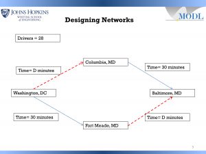
Example of problem involving transportation networks by Sauleh Siddiqui.In his course, Equilibrium Models in Systems Engineering, students work on real-life examples such as designing transportation networks. To demonstrate an exercise that Siddiqui uses in his course, he passed out clickers to the audience, as his students would use. He then set up a problem involving getting from Washington, DC to Baltimore, MD using a combination of driving and taking a train, with two possible routes. Driving time on each route will vary depending on the number of cars on the road. The model is set for the number of participants/students in the group—if there are 28 participants driving on the same route, the driving part of the trip will take 28 minutes. If there are 5 participants driving on the route, it will take 5 minutes. The train trip is static and takes 30 minutes on each route. Using their clickers, participants vote on a route, A or B. Siddiqui then show the histogram of the vote, and participants can change their vote based on the road time component. As participants change votes, the driving time will increase or decrease on each choice. Voting continues until eventually a state of equilibrium is reached and the driving time on the two routes is equal.

Siddiqui then throws in another component. What happens if you add another variable, a new road? Participants can now vote for three options. Ultimately his students will see (as did the participants at the Lunch and Learn) that sometimes a third option can worsen the situation rather than improve it.

In his classes, students work with actual examples taken from New York City, Germany, South Korea, and other places, to examine the factors that went into the design process, and analyze what went wrong. Siddiqui feels that engineers are not necessarily taught to work with real-life situations and this can lead to poor design. Engineers need to understand the factors that impact actual human decision making in order to build successful solutions.

In the discussion period that followed the presentation, Balachandran and Siddiqui agreed that students are motivated by working with real-life problems. Siddiqui noted that his students still had to “slog through” doing the mathematics behind the exercises, but valued understanding both sides.

In discussing how to gauge whether an assignment or project was too big or too small, it was agreed that it is important to scaffold larger projects, build support structures, and allow for flexibility. It was acknowledged that students will struggle with ambiguity. It is important with authentic assignments to be clear that the goal is not so much to find an answer as to go through a process.

Both presenters agreed that setting up these authentic learning experiences—assignments, projects, and courses, can be time consuming and challenging. But, for both, the benefits for students have been substantial and they will continue to explore the possibilities for future classes.

Macie Hall, Senior Instructional Designer
Center for Educational Resources

Image Sources: Lunch and Learn Logo, slides from Balachandran and Siddiqui presentations

Midterm Course Evaluations

Many of us are reaching the mid-semester mark and students are anticipating or completing midterm exams. Perhaps you are in the throes of grading.  Now is a good time to think about letting your students grade you, in the sense of evaluating your teaching. Think of this as a type of formative assessment, an opportunity for you to make corrections to your teaching strategies and clarify student misconceptions.

There are several ways to obtain feedback and these evaluations do not needTwo buttons, green with a thumbs up and red with a thumbs down. to be lengthy. Examples and resources are explored below. Popular among instructors I’ve talked to are short, anonymous surveys, offered either online or on paper. Blackboard and other course management systems allow you to create surveys where student responses are anonymous but you can see who has responded and who has not, making it easy to track. You want to keep these evaluations focused with three or four questions, which might include: What is working in the class/what is not working? What change(s) would you suggest to improve [class discussions/lectures/lab sessions]? What is something you are confused about? Have you found [specific course assignment] to be a useful learning activity?

As the Yale Center for Teaching and Learning states on their website page Midterm Student Course Evaluations: “Midterm course evaluations (MCE) are a powerful tool for improving instructors’ teaching and students’ learning.  … MCE provide two critical benefits for teaching and learning: the temporal advantage of improving the course immediately, and the qualitative benefit of making teaching adjustments specific to the particular needs and desires of current students. In addition, MCE generally produce better quality feedback than end-of-term evaluations since students have a shared stake in the results and instructors can seek clarification on any contradicting or confusing responses.” The Yale site offers useful examples, strategies, and resources.

Michigan State University Academic Advancement Network offers a comprehensive guide with Mid-term Student Feedback, which includes research citations as well as examples. Here, too, you will find a list of resources from other universities on the topic, as well as more in-depth methods to gain student feedback. There is also a section with tips on effective use of information gained from student feedback.

A sampling survey-type midterm evaluations can be found in PDF format at the UC Berkeley Center for Teaching and Learning: Teaching Resources: Sample Midterm Evaluations. This document will get you off and running with little effort.

Ideally you will be using the results on the midterm exam or other learning assessment as a gauge along with the teaching evaluations. If the learning assessment is indicating gaps in content understanding, you can see how it aligns with feedback gained from the student evaluations. The value is that you can make timely course corrections. Another plus—students will see that you are genuinely interested in your teaching and their learning.

Macie Hall, Senior Instructional Designer
Center for Educational Resources

Image Source: Pixabay.com

We Have a Solution for That: Student Presentations, Posters, and Websites

Some of our faculty are moving away from traditional end-of-semester assessments, such as term papers and high-stakes final exams, in favor of projects that can be scaffolded over a period of time. These may include having students share their research in an oral presentation, poster, or website. The question is, how do you support their research output? Fortunately, we have some solutions!

If your students are doing either oral presentations or electronic posters, check out Prezi Next, the new version of the online presentation application. [See our post on the original version, The Power of Prezi, from October 2014.] The new version, which runs on HTML5 rather than Adobe Flash, offers many more templates, a more intuitive interface, supports more file types, and is easier to navigate while presenting. While Prezi is great for a linear presentation, one advantage is that presentations can be designed to be non-linear, useful for facilitating a less formal discussion for example.

Looking for a presentation software that allows for easy collaboration among student team members? Check out Google Slides. Like Google Docs and Google Sheets, access to the slides can be shared and multiple users can work on the sides remotely and simultaneously—there’s even a chat feature to make group editing easy. There are some nicely designed templates, themes in Google-speak, and you can easily integrate content from Google spread sheets and documents. There is also a downloadable version of Google Slides for desktop use.

If you don’t like the templates in PowerPoint or Google Slides, check out Slides Carnival, which has many creative templates available for download, including fonts, icon sets, maps, and charts, graphs, and tables styled for each template. These work with both PowerPoint and Google Slides.

If you are looking to have your students create a website, Google Sites has recently come out with a new version of its website creation application. When you sign into Google Sites you can choose to use the classic version or the new one. The new version gives you fewer options (just six themes available currently), but is a snap to use, being essentially drag and drop. There no messing with HTML code, and it is easy to tie into the content from your other Google apps. There is an “add editors” feature that will facilitate group work. It’s a great option when you want your students to be focused on creating content, not on struggling with technology.

We also have some resources for students doing presentations and posters—online videos on creating and designing effective PowerPoint presentations and posters, as well as some handouts on these topics. See Presentation Strategies on the CER website. If your students (or you) are looking for freely-available and rights-free visual resources (images and multimedia) check out CER’s Visual Resources page.

Macie Hall, Senior Instructional Designer
Center for Educational Resources

Image Source: cc Wikimedia Commons

We Have an App for That! SketchUp

SketchUp logo.SketchUp is a three-dimensional rendering application that uses a sketch-based approach for creating models. It may be beneficial to anyone looking to visualize three Screen shot showing the range of items (people, landscaping, buildings, monuments, vehicles, appliances, furnishings) that can be drawn with SketchUp.dimensional structures, spaces, or objects. With a free-to-use version available for download, SketchUp is an affordable way to develop 3D models. It is easy to learn compared to professional 3D graphic software packages.

The application was created in 2000 by @Last Software. Google purchased SketchUp in 2006. Under Google’s ownership, the program was developed further and integrated with Google Earth to allow importing models for geo-location. In 2012, Google sold SketchUp to Trimble Inc., a mapping, navigation, and surveying equipment company. Trimble continues to develop the application and support SketchUp’s growing community of users.

Three-dimensional rendering software is typically complex and requires a significant time investment to learn and use. SketchUp was developed to be intuitive and easy to learn with the intent to bring “3D modeling to the masses.” It was used early on by architectural firms to provide quick concept renderings of buildings and environments. Today, the application is used by interior designers, landscape architects, civil and mechanical engineers, and film and video game creators. There are use cases for the program ranging from exploring building structures, conceptualizing mechanical objects, teaching complex structures, and remodeling houses.

Using your imagination to conceptualize physical spaces is difficult. CommunicatingSketchUp drawing showing a building in ground elevation. ideas and concepts that involve spatial and volumetric relationships in space, such as comparison of size and distance between objects, is often more effectively accomplished by sharing visualizations and renderings of the subject. This allows viewers to have a common point of reference in which to talk about details.

Three-dimensional models offer immersive and engaging aspects that are potentially exciting to viewers. For example, sharing a virtual walkthrough of an ancient city or a 360-degree view of a design prototype can make the experience memorable for your students, which helps them retain the information presented.

Creating three-dimensional models for pedagogical purposes has traditionally required the use of expensive professional modeling applications and highly skilled staff. SketchUp’s free modeling tools make the process of creating models an intuitive experience. This can be a great starting point for faculty to produce three-dimensional models and environments. Moreover, your students may not have developed the ability to think spatially. Assigning a course project that involves the use of SketchUp creates an opportunity for learning these skills.

Screenshot of SketchUp building plan showing extensions and repositories.SketchUp provides accurate tools for the rendering of objects and spaces. As an easy entry point for CAD (Computer Aided Design) software, SketchUp can be used in disciplines that require technical drawings and diagrams. For example, SketchUp can be used to conceptualize urban planning initiatives to think through the impact of proposed changes to a community. Resulting models can be shared with stakeholders complete with walkthrough animations and annotations to provide additional information.

Drawing of a verge and folio mechanism created in SketchUp by Reid Sczerba.

Example diagram of verge and folio mechanism created in SketchUp.

SketchUp can be particularly useful for design projects in engineering disciplines that require the development of prototypes, such as a design project to develop a radio transmitter and receiver within a size specification that could withstand an impact of 100 pounds of force. Team-members could use SketchUp to map out the circuitry for the electrical components and develop the housing. There are methods to use a SketchUp model to create a physical prototype with a 3D printer.

At Hopkins, Bill Leslie, a professor of History of Science and Technology, had in the past required students to build a shoebox diorama of a museum exhibition featuring a topic of their choice. After discovering SketchUp, he offered students the option to create their exhibition space in 3D. The students were unanimous in choosing SketchUp, which improved both the consistency of the projects and the logistics of presenting them to class. Students demonstrated creativity and engagement in the project.

Interest in virtual and augmented reality has increased in recent years. Companies have developed new technologies and methods to offer opportunities for people to experience virtual environments. Universities have been investigating technologies such as Google Cardboard, Oculus Rift, and Microsoft HoloLens. Currently, there is a lack of content available to make use of these emerging technologies. SketchUp could find itself in a position to be a starting point for the creation of 3D spaces that can be experienced in a highly immersive environment.

Trimble offers a free version of the application called SketchUp Make. It includes all of the basic features for modeling. SketchUp Pro is a full featured version that includes features such as solid modeling tools, importing terrain and satellite imagery, dynamic components, and importing and exporting file formats necessary for use in other applications. If you are an educator and plan on teaching with SketchUp, you can request a free one-year license to use the full-featured SketchUp Pro. Students are also able to get a discount on a one-year license with proof of enrollment.

There are video tutorials available for learning SketchUp. These tutorials are often the most efficient way to learn the application and get a quick start on a project.

One of the best resources from the SketchUp community is the 3D Warehouse, an online repository for sharing user-generated models. The models found in the 3D Warehouse can be a starting point for your own projects. There are a number of companies that have uploaded professionally created models of their products so if you are looking for a specific model of say, a household appliance, you may find it there.

SketchUp is highly extendable, giving users the ability to develop plugins with the Ruby programming language. The Extension Warehouse is a repository of plugins you may install in your instance of SketchUp. Not all plugins are free, but if you need to have a photo-realistic polish or find a way to streamline a modeling process, the Extension Warehouse may have the answer.

Additional Resources

This post originally appeared as part of our Innovative Instructor print series in the Technology forum as SketchUp.

Reid Sczerba, Multimedia Development Specialist
Center for Educational Resources

Images sources: Logo and screenshots from SketchUp.com, Verge and Folio digram CC Reid Sczerba.

Quick Tips: Considerations for Flipping Your Course

Text reading flipping the classroom with the classroom upside downThe Innovative Instructor is offering a quick tip during this busy first week of classes. Have you been thinking about flipping your class? We’ve written a number of posts on the subject previously—see the list below—but we’ve just released a new guide: Considerations for Flipping Your Class [PDF]. The guide will help focus your thinking by asking questions about activities planned for class time, addressing recording issues and student access to recordings, and suggesting best practices. The primary audience is the Johns Hopkins faculty that our center serves, but the guide will be useful to anyone in the initial phase of thinking about hybrid teaching. We recommend consulting the teaching and learning staff at your institution for assistance. The following articles may also provide insight as you plan your strategy for flipping your course.

  1. Flipping a Statistical Analysis Course (January 31, 2017) by Avanti Arthreya and Dan Naiman
  2. Lunch and Learn: Flipped courses: What is the purpose? What are the strategies? (October 26, 2016)
  3. A Manual for Flipping Your Classroom (January 14, 2015)
  4. Flipping Your Class Humanities Style? (March 10, 2014)
  5. Quick Tips: Flipping Your Classroom (August 14, 2013)
  6. 2013 GSI Symposium Breakout Session 3: Flipping the Classroom (February 20, 2013)
  7. Flipping Your Class (January 23, 2013)

Macie Hall, Senior Instructional Designer
Center for Educational Resources

Image Source: CC Macie Hall 2013